
Analysts building defensible MSA industry trend benchmarks should start with two federal series: BLS metro labor data (LAUS and CES) for employment and unemployment, and BEA county-level GDP and personal income tables aggregated up to the metro footprint defined by the current OMB delineation file. The catch is that BEA no longer publishes official MSA-level GDP, so county aggregation is now a required step, not an option. Analysts pressed for time can also license court-accepted benchmarks from a vendor like Bizminer instead of building the aggregation themselves.
TL;DR:
- Building accurate MSA benchmarks requires aggregating county-level data from BEA and ensuring the use of the correct OMB delineation vintage for consistency.
- Local trends in employment, population growth driven by immigration, and consumer price variation significantly impact cost and margin benchmarks across metros.
- Analysts must disclose data sources, suppression handling, and aggregation methods explicitly to maintain credibility in audit or client reviews.
- Using purchased Bizminer reports simplifies the process by providing pre-aggregated, documented benchmarks that are accepted in legal and government contexts.
- Variations in metro-specific conditions mean national averages are unreliable for precise industry benchmarking without metro-specific adjustments.
Table of Contents
- What recent metro trends mean for industry analysis
- A step-by-step workflow for building metro benchmarks
- Turning trend data into industry financial benchmarks
- Why Bizminer’s data holds up under scrutiny
- What the workflow actually gets you
- Getting MSA benchmarks without building them yourself
- Where to verify the data yourself
- Sources
- FAQ
What recent metro trends mean for industry analysis
Metro economies are diverging in ways that matter for anyone building industry-level benchmarks. Labor markets, population growth, and local prices are all moving at different speeds across the country, and averaging them into a single national figure hides the signal an analyst actually needs.
BLS tracks monthly employment and unemployment across 387 MSAs and 37 metropolitan divisions, and the spread between metros is wide enough that a national unemployment figure tells you almost nothing about a specific market. Population growth is uneven too. Brookings’ Metro Monitor analysis found that immigration drove the 2023 to 2024 metro population rebound, and that metros expanding housing supply faster than population growth tend to avoid the affordability crunch that throttles labor availability elsewhere.
Local prices compound the problem. The Pew Research Center has documented that consumer prices have risen unevenly across metro areas, with some metros seeing far sharper increases in rent and utilities than others. That variation directly affects margin benchmarks, because a payroll or occupancy cost that looks high in one metro may be normal in another.
Three patterns matter most for industry-level work:
- Metro labor markets are not moving in sync, so national employment trends mask metro-specific conditions.
- Population growth tied to immigration is reshaping labor supply unevenly across metros.
- Local price differences distort cost and margin comparisons unless adjusted for the specific metro.
Bizminer note: BLS’s monthly metro releases cover 387 distinct MSAs, which is the baseline geography analysts should reconcile against before pulling any other dataset.
A step-by-step workflow for building metro benchmarks
Building a defensible MSA industry trend benchmark from public data follows a consistent sequence, and skipping steps is where most homemade benchmarks fall apart under review.
- Choose the MSA and time period, then lock the corresponding OMB delineation file so your county list is fixed for the whole analysis.
- Download BLS LAUS and CES series for the metro, and pull BEA county GDP and personal income tables for every county in the delineation.
- Aggregate the county figures using BEA’s geo-aggregator method, rolling suppressed leaf-industry cells up to higher-level totals rather than imputing values.
- Harmonize NAICS levels across sources, pick the industry granularity your benchmark needs, and write down exactly how each code was mapped.
- Compute the trend measures you actually need: annualized growth, employment share by industry, and wage change, then convert those into percentile benchmarks against peer metros.
- Run a quality check on the suppressed and reclassified cells, and draft a short methods disclosure that names your data vintages, delineation file, and aggregation choices.
The disclosure step is not optional if the benchmark will ever face a client questioner or a tax authority. Naming your BEA release date, your OMB delineation vintage, and your NAICS crosswalk turns a spreadsheet into something a reviewer can actually audit.
Pro Tip: Keep a one-page methods memo alongside every benchmark you deliver: sources, vintages, and any cell you had to flag as suppressed or imputed.
Turning trend data into industry financial benchmarks
Once the trend metrics exist, the real work is choosing which benchmarks matter and being honest about their uncertainty. Revenue growth, payroll per employee, margin ranges, industry concentration, and a local price adjustment are the core outputs most accountants and lenders ask for.
Comparator selection matters more than most analysts admit. Peer metros should be picked by population size, industry cluster similarity, and NAICS mix, not just by being in the same state. A cluster-aware approach avoids the common mistake of comparing a manufacturing-heavy metro to a service-heavy one just because they share a state border.
Reporting should carry its uncertainty openly. A benchmark built on aggregated county data should note the delineation vintage used, flag any suppressed cells that were rolled up rather than reported directly, and state the aggregation method in one sentence a client can read without a statistics background.
- Core benchmarks: revenue growth, payroll per employee, margin ranges, and industry concentration.
- Comparators: peer metros matched on size and industry mix, not state alone.
- Disclosure: name the delineation vintage, suppression handling, and aggregation method used.
Bizminer note: the Brookings Metro Monitor attributes the recent metro population rebound largely to immigration, a factor worth naming explicitly when a benchmark’s labor supply assumptions depend on population trends.
Building this internally from BLS and BEA data typically takes days of aggregation and documentation work per metro. A purchased report compresses that into a single deliverable, at the tradeoff of losing the ability to adjust the methodology mid-project.
Why Bizminer’s data holds up under scrutiny
Some vendors offer custom financial data profiles and reports across thousands of markets, filtered by industry, geography, and business size, providing the granularity analysts seek when reconstructing data from BLS and BEA sources. Such reports can be customizable to specific MSA and NAICS code combinations, rather than relying on broad sector averages for local markets.
Data accepted in U.S. Tax Court and used by government agencies offers a credibility baseline for audit-facing or litigation-adjacent work that homemade benchmarks typically must build through detailed methods documentation.
Data reliable enough for U.S. Tax Court is data reliable enough for a client engagement letter.
This article does not include internal case studies or proprietary accuracy tables, and readers who need that level of detail should request a sample report or methodology documentation directly rather than relying on secondhand description.
What the workflow actually gets you
The honest conclusion after building an MSA benchmark from scratch is that the hard part is never the math. Computing a growth rate or a payroll percentile is trivial. The hard part is defending the county list, the suppression handling, and the NAICS crosswalk you used to get there, and that is exactly the part most guides skip.
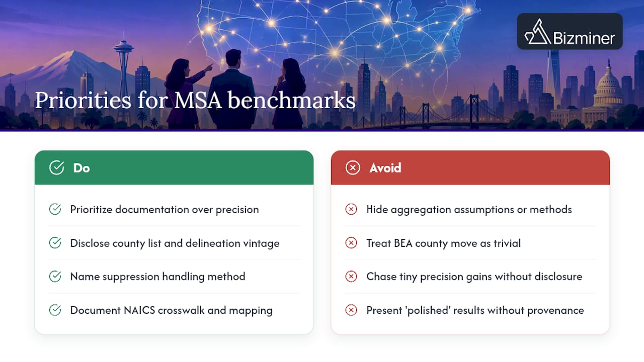
Conventional advice treats the BEA’s move to county-only publication as a minor technical footnote. It is not. It shifts real analytical labor onto every accountant and advisor who used to pull a clean MSA GDP figure and now has to build one, and a benchmark that does not disclose how that aggregation happened is not defensible in front of a skeptical client or a tax examiner.
If there is one thing to prioritize, it is documentation over precision. A benchmark that is slightly rough but fully disclosed will survive scrutiny better than one that looks polished but hides its aggregation assumptions. Get the delineation vintage right, name your suppression handling, and the rest of the analysis takes care of itself.
— Danny
Getting MSA benchmarks without building them yourself
Accountants and advisors who would rather skip the county aggregation entirely can go straight to a finished product. Bizminer sells one-off Industry Financial Performance reports and Market reports built to the metro and NAICS detail a client engagement needs, without the multi-day workaround the BEA’s county-only publication now requires.

- One-off reports for a specific industry and metro, priced per report through the pricing page.
- Subscription licenses are offered for advisors and firms needing regular access to metro benchmarks.
- Prospect lists and customizable API feeds are available for teams requiring underlying data integration.
A purchased report arrives with the aggregation, suppression handling, and NAICS mapping already documented, which is the piece that takes the most time to build internally. Anyone weighing the workflow in this article against a finished deliverable can request a sample report or check current pricing before deciding.
Where to verify the data yourself
Every figure and method described above traces back to a public source, and analysts should bookmark these for ongoing work rather than relying on secondhand summaries.
- BLS LAUS overview for monthly metro employment and unemployment programs.
- BEA’s geo-aggregator technical document and its 2024 county GDP release for deriving metro estimates.
- Census delineation files and the Brookings Metro Monitor for metro definitions and growth context.
Sources
Four sources anchor a defensible MSA analysis, and each has a specific gap you need to plan around.
BLS’s LAUS and CES programs publish monthly employment and unemployment by metro area, and CES adds industry-level payroll detail. These are the most current metro labor inputs available and the right starting point for any trend analysis.
BEA used to publish official GDP and personal income at the MSA level, but that changed. The agency’s 2024 county-level release formally discontinued MSA tables in favor of county tables and the Interactive Data Application, which means analysts now have to build their own metro aggregates from county data.
BEA’s own geo-aggregator technical document describes how to do that aggregation and warns that derived metro estimates can be of lesser quality than the discontinued official series, particularly where suppression or price-indexing differences distort the county-level inputs.
OMB delineation files, maintained through the Census Bureau, define which counties belong to which MSA, and those definitions change periodically. Using the wrong vintage breaks longitudinal comparisons.
- Local Area Unemployment Statistics (LAUS) overview — BLS
- Technical Document: An Approach to Geographic Aggregations of County Statistics — BEA
- Gross Domestic Product by County and Personal Income by County, 2024 — BEA news release
- Metro Monitor 2025: Growth and affordability trends — Brookings
- Delineation files for metropolitan and micropolitan statistical areas — U.S. Census
Pro Tip: Lock the OMB delineation file to the exact year of your analysis before pulling any county data, and note the delineation vintage in your workpapers so a reviewer can reproduce your county list.
FAQ
Why did the BEA stop publishing MSA-level GDP data?
The BEA’s 2024 combined county release formally discontinued official MSA GDP and personal income tables in favor of county-level data. Analysts now need to aggregate county figures themselves using the BEA’s published geo-aggregator method to reach a metro estimate.
How do I handle suppressed data when aggregating county figures to an MSA?
BEA’s geo-aggregator guidance recommends rolling suppressed leaf-industry cells up to higher-level industry totals wherever those totals are available, rather than substituting an imputed number. Any cell that remains suppressed after that step should be flagged explicitly in your methods disclosure rather than estimated silently.
Why does the OMB delineation file matter for a multi-year metro comparison?
OMB delineation files, maintained by the Census Bureau, define which counties make up a given MSA, and those definitions are updated periodically. Comparing two years of data built on different delineation vintages can make a metro look like it grew or shrank when the real change was just which counties were counted.
Is Bizminer data considered reliable for tax or audit work?
Bizminer data is accepted in U.S. Tax Court and used by government agencies, which supports its use in audit-facing and litigation-adjacent engagements. Reports are available as one-off purchases or through a subscription license, with pricing listed on Bizminer’s pricing page.
Should I use CES or QCEW data for metro industry employment?
CES provides nonfarm payroll employment estimates by industry for metro areas and is the better fit for tracking jobs on payrolls over time. QCEW offers establishment-level counts by county and industry, which suits analyses centered on where jobs are physically located rather than metro-wide payroll trends.