A location quotient is a ratio of ratios: it divides an industry’s share of local employment by that same industry’s share of employment nationally (or in whatever benchmark you pick). A result above 1.0 means the industry is more concentrated locally than in the reference area, and analysts generally treat anything above roughly 1.25 as a signal of export activity, meaning the area likely produces more of that good or service than it consumes locally.
TL;DR:
- A high location quotient above 1.25 indicates the area may produce more of that industry’s good or service than it consumes locally, signaling potential export activity.
- Employment-based LQs are most common, but payroll and output LQs can reveal different economic insights, especially in sectors with high wages or low employment.
- Small workforce counts can skew LQs dramatically, so averages over multiple years or larger geographic units are necessary to obtain reliable signals.
- A high or low LQ alone does not determine viability; it must be combined with wage trends, firm health, and growth data to inform strategic decisions.
- Using consistent geographic boundaries, aggregating data, and accounting for NAICS reclassifications are essential to avoid common pitfalls in LQ analysis.
Table of Contents
- What Is Location Quotient Analysis, and How Is It Calculated?
- Where to Get the Data: QCEW, OES, CBP, and Beyond
- How Do You Calculate a Location Quotient Step by Step?
- What Does a High or Low Location Quotient Actually Mean?
- What Are the Common Pitfalls in Location Quotient Analysis?
- Where Location Quotient Analysis Gets Used in Practice
- Who Backs This Guidance, and Why It Holds Up
- Why Most Location Quotient Reports Stop Too Early
- Validate What Location Quotient Analysis Tells You
- Sources
What Is Location Quotient Analysis, and How Is It Calculated?
The formula rarely changes across textbooks, but the terms inside it do a lot of work. The Quarterly Census of Employment and Wages reporter’s guide lays out the standard version:
LQ = (Local industry employment ÷ Local total employment) ÷ (National industry employment ÷ National total employment)
Read it as two shares stacked on top of each other. The numerator is how big an industry looms in your local economy. The denominator is how big that same industry looms nationally, or in whatever region you’re using as the yardstick. Divide one by the other and you get a single number that tells you whether the local area punches above or below its weight in that sector.
Employment is the most common input, but it’s not the only one, and the choice matters more than most first-time users realize:
- Employment-based LQ compares headcount shares. It’s the default for workforce and cluster work because it lines up cleanly with occupational data.
- Establishment-based LQ compares the number of business locations rather than workers. This version is useful when you’re studying industry structure, like whether a region has an unusual density of small shops versus large plants.
- Payroll or output LQ compares wage bills or gross output. This variant surfaces industries that pay well but employ relatively few people, something a pure employment count can hide.
Pick the metric based on the question, not habit. A region can show a modest employment LQ in finance while its payroll LQ tells a completely different, more lucrative story.
Where to Get the Data: QCEW, OES, CBP, and Beyond
Every location quotient is only as good as the data feeding it, and the practical challenge is usually not the math but the sourcing. Three federal datasets cover most needs.
- QCEW (Quarterly Census of Employment and Wages) gives you establishment counts, employment, and payroll by NAICS code down to the county level. It’s the workhorse for standard industry LQs, largely because it’s near-universal in coverage since it comes from unemployment insurance filings.
- OES (Occupational Employment and Wage Statistics) breaks employment and wages out by occupation rather than industry, which is what you want for workforce and training analysis rather than industry-cluster work.
- Census County Business Patterns (CBP) offers establishment counts by employment-size class, useful when you need finer detail on business size distribution than QCEW provides.
The Bureau of Economic Analysis and BLS both publish explanatory notes on how these series get built, and it’s worth reading them once before you build a model you’ll reuse for years.
Beyond the federal trio, state labor agencies often publish their own LQ tables, and proprietary platforms fill gaps the government sources leave open, particularly at the company level. When a NAICS code is too coarse or a county too small, a multi-year average smooths out one-time hiring swings that would otherwise distort a single-year snapshot. Before pulling anything, nail down your geography level and confirm the NAICS or occupation code actually matches the industry you think you’re measuring. A quick check against NAICS sector definitions catches more coding errors than people expect.
How Do You Calculate a Location Quotient Step by Step?
The process is five steps, and the arithmetic itself takes about thirty seconds once you have the numbers in front of you.
- Select your geography and industry code. Decide whether you’re benchmarking a county against the state, or a metro against the nation, and pick the specific NAICS code you’re testing.
- Pull local and reference employment counts. Get total employment and industry employment for both your local area and your benchmark area, ideally from the same QCEW vintage.
- Compute each area’s industry share. Divide industry employment by total employment separately for the local area and the reference area.
- Divide local share by reference share. That quotient is your LQ.
- Interpret the result in context. Check it against employment size, wage levels, and trend data before drawing conclusions.
Here’s a worked example. Say a county has 1,200 workers in machinery manufacturing out of 40,000 total workers. Nationally, machinery manufacturing employs 900,000 out of 150,000,000 total jobs.
Local share: 1,200 ÷ 40,000 = 0.030
National share: 900,000 ÷ 150,000,000 = 0.006
LQ = 0.030 ÷ 0.006 = 5.0
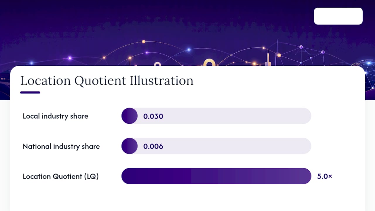
An LQ of 5.0 means the county’s machinery manufacturing employment is five times more concentrated than the national average — a strong signal that this is an export-oriented sector worth a closer look, maybe through the industrial machinery manufacturing data available for that NAICS code.
Small numbers cause the most trouble in real work. A rural county with fifteen workers in a niche industry can post an LQ of 8 or 12 purely from statistical noise, since one new hire shifts the ratio dramatically. The BLS occupational analysis on location quotients documents exactly this pattern in small-area occupational data. Three fixes handle most cases: aggregate several years into a rolling average, roll the geography up to a larger area, or aggregate the NAICS code up one level of detail. When none of that resolves the volatility, the honest move is to flag the LQ as unreliable rather than report a misleadingly precise number.
What Does a High or Low Location Quotient Actually Mean?
An LQ of exactly 1.0 means the local area mirrors the reference area’s mix for that industry, no more concentrated, no less. Everything interesting happens above or below that line, and the QCEW’s own guidance treats roughly 1.25 as the threshold where an industry starts looking export-oriented rather than merely present.
A few rules of thumb keep the number from being misread:
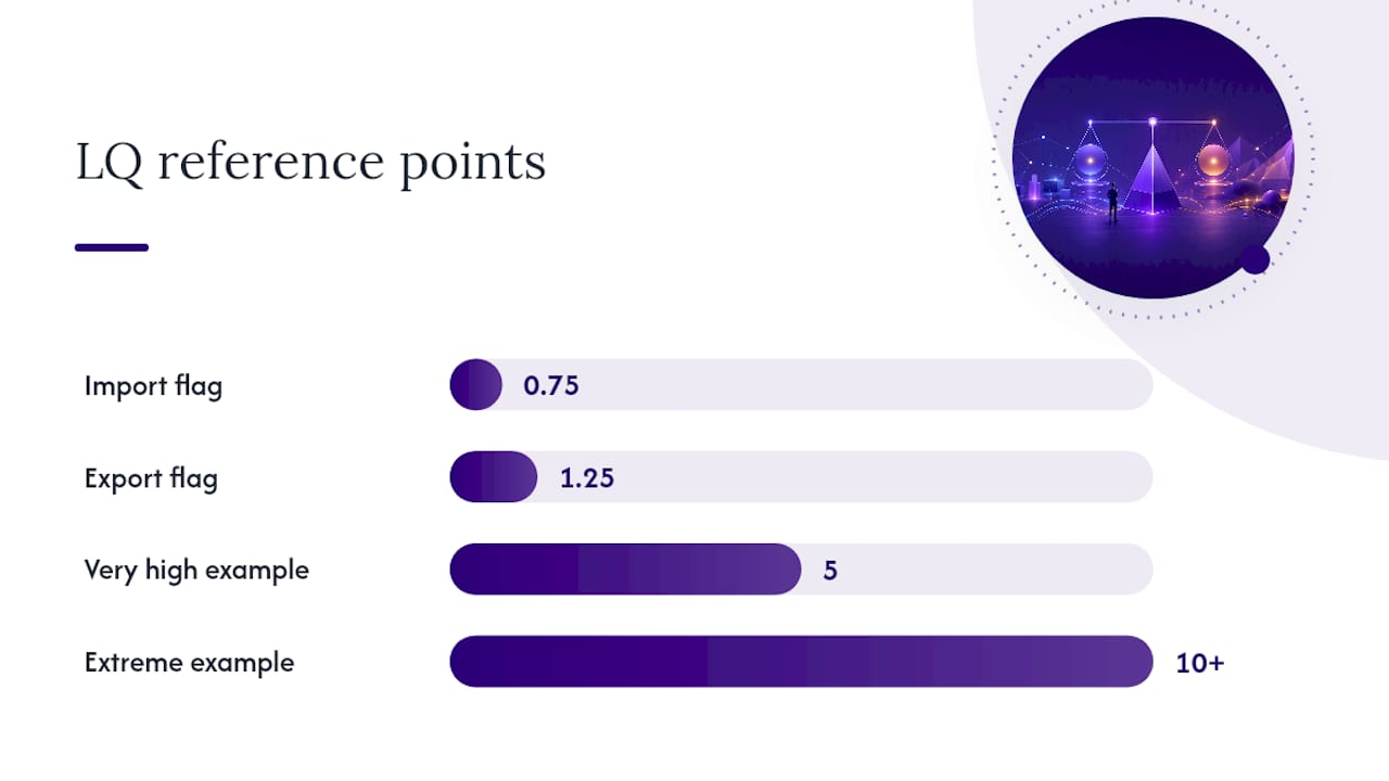
- LQ between 0.75 and 1.25 usually indicates the industry serves mostly local demand, neither a specialty nor a gap.
- LQ above 1.25 suggests the area produces more of that good or service than local demand requires, pointing to exports, tourism draw, or a genuine industry cluster.
- LQ below 0.75 often flags an import-dependent sector, one where the area relies on outside supply.
- Very high LQs (5, 10, or more) need a size check. A tiny workforce base can produce a dramatic-looking ratio that means very little in absolute economic terms.
The number itself is a screening tool, not a verdict. Pair it with employment size, average wages, and multi-year growth trends before recommending action, and when the signal looks strong enough to justify a follow-up study, shift-share analysis or input-output modeling will tell you whether that concentration is growing, shrinking, or just holding steady against the regional trend.
Pro Tip: Never act on a single year’s LQ alone. Pull at least three years and watch the trend line — a sector climbing from 1.1 to 1.6 tells a completely different story than one that’s been sitting at 1.6 the whole time.
What Are the Common Pitfalls in Location Quotient Analysis?
The math behind an LQ is simple enough that people trust it more than they should. Three problems account for most of the bad calls analysts make with this metric.
- The Modifiable Areal Unit Problem (MAUP): the same underlying data can produce different LQs depending on how you draw the geographic boundary, county versus metro versus state. The WVU technical document on location quotients recommends picking one consistent benchmark geography and sticking with it across an entire study rather than switching levels mid-analysis.
- Small-count volatility: a handful of jobs added or lost in a thin sector can swing an LQ wildly from one year to the next, which is why multi-year averaging and NAICS aggregation matter more in rural or small-metro work than in large urban areas.
- NAICS reclassification: the Census Bureau updates NAICS codes periodically, and a code that meant one thing in 2017 might capture a slightly different set of businesses by 2027. Time-series LQ work needs to account for that or risk mistaking a coding change for real economic movement.
None of these pitfalls disqualify the method. They just mean an LQ works best as one input among several, not a standalone verdict.
Where Location Quotient Analysis Gets Used in Practice
Economic development offices lean on LQ analysis constantly, mostly to figure out which industries are actually worth chasing with incentives. A high, stable LQ in a growing sector is a far better recruitment pitch than a gut feeling about “what the region is good at.”
Workforce boards use occupational LQs the same way. If welders show an LQ of 2.1 in a metro area while the community college offers no welding program, that’s a training gap worth funding, and it’s the kind of alignment analysis that supports industry cluster work for advisors building out a regional strategy.
Site selection consultants and business strategists often run the calculation in reverse. Instead of asking “what’s already concentrated here,” they ask “where is this industry already concentrated,” using LQ maps to shortlist regions with an existing supplier base or skilled labor pool. For deeper due diligence, comparable market intelligence from partners like US Market Intelligence can round out a regional picture with company-level detail that a pure BLS series won’t capture.
The step most people skip is checking whether a high-LQ industry is actually financially healthy. A sector can be locally concentrated and still be struggling, thin margins, declining revenue, aging ownership. That’s where company-level financial benchmarks come in, because concentration alone doesn’t tell you whether the businesses behind the number are worth building a strategy around.
Who Backs This Guidance, and Why It Holds Up
This guide draws on formulas and interpretation standards published directly by the BLS and BEA, not secondhand summaries. Bizminer applies the same rigor at the company level, producing custom financial data profiles across more than 9,000 markets, data accepted in U.S. Tax Court and used by government agencies for exactly the kind of due diligence this article describes. That track record matters when a high LQ needs a second opinion: pairing a concentration signal with granular, company-level benchmarking is how you find out whether a cluster is actually thriving or just present in the numbers.
Why Most Location Quotient Reports Stop Too Early
Most LQ write-ups treat the number as the finish line. It isn’t. An LQ tells you where to look, not what you’ll find when you get there, and treating a 1.6 as proof of a thriving cluster is the single most common misstep I see in economic development pitches and site-selection memos alike.
The conventional advice, run the ratio, flag anything above 1.25, is fine as a first pass. Where it falls short is stopping there. A concentrated industry with flat wages and shrinking establishment counts is a warning sign dressed up as an opportunity. The practitioners who get this right treat LQ as a filter that narrows a list of hundreds of NAICS codes down to a handful worth real scrutiny, then spend their actual analytical effort on wage trends, firm-level margins, and growth trajectories within that shortlist.
If you’re building a regional strategy on LQ alone, you’re building it on half the evidence. The number earns its place at the start of the analysis, not the end.
— Danny
Validate What Location Quotient Analysis Tells You
An LQ can point you toward a promising sector, but it can’t tell you whether the businesses inside that sector are actually profitable, growing, or worth an incentive package. Custom financial data profiles across numerous markets can help you check a high-concentration industry against real company-level performance before you write a recommendation.

If your county just posted an LQ of 3 in a manufacturing subsector, the next move isn’t a press release, it’s pulling the industry benchmarks behind it. Bizminer’s market and industry research reports let you check margins, growth, and firm-level financial health for the exact NAICS code your LQ flagged, so the number that started your analysis doesn’t end up being the only thing behind it. Start there before you finalize any recommendation built on a location quotient.
Sources
- Quarterly Census of Employment and Wages (QCEW) reporter’s guide — location quotient formula
- Location Quotient, Coefficient of Specialization and Shift-Share (WVU technical document)